Selected Work
About Me
Toga Cox is a Freelance Design Lead based in Brooklyn with over a decade of experience across agencies like Droga5 and 72andSunny, and in-house teams at Spotify and Facebook. He brings a systems mindset and high craft to every project, with a multi-disciplinary skillset that lets him move fast and go wide while maintaining cohesion.
Toga works at the intersection of brand, marketing, and product, building identity systems strong enough to flex from a campaign to a product surface without losing themselves. At Spotify that meant bridging marketing and product teams; at Meta, building a graphic system any department could run. The work itself stays bold: punchy graphics, tasteful typography, high contrast.
That approach has taken him from designing award-winning ad campaigns to exhibiting during Art Basel Miami and having his photography published in The New York Times.
When he's not designing, he's writing music for indie films, at the gym, building furniture, playing with his two cats, or taking street photography in your neighborhood.
Toga is planning a move west and looking for the freelance or full-time role that takes him there. Bay Area and LA top the list.
Archived Work
Overhead Originals is a first-of-its-kind live-music platform for Delta Air Lines, in partnership with YouTube: original sets filmed inside a real Delta cabin, released in-flight and on Delta's channels. It launched in April 2025 with Grammy winner Leon Thomas.
As a freelance Design Lead and Art Director at Kin, I co-led the brand identity. The airplane window became the identity's central motif, a stage in the sky framing every artist and moment. From it we drew echo shapes that ripple outward, giving visual form to music and sound. We created the logo and its system, set the vision for the art direction, and wrote the guidelines for Delta's creative teams to execute against, covering social, digital ads, and out-of-home.
Spotify for Artists needed its own identity distinct enough to speak to creators, but unmistakably Spotify. I helped define the visual system: typography, color, and a photography direction rooted in three moments of an artist's journey: performing, creating, and connecting with fans. Beyond the core identity, I built out templates for email, social, and marketing pipelines, and served as a bridge between marketing and product teams to ensure brand consistency from campaigns through to the redesigned Spotify for Artists digital hub.
De Beers asked me to revisit their iconic "Seize the Day" campaign for the 2023 holiday season, this time targeting a younger audience. I updated the headline-driven campaign with contemporary typefaces and layouts while preserving the elegance of the original. Print OOH stayed refined, but digital and social pushed into more expressive territory with animation and 3D renders to connect with a new generation. I also built out the full banner and template system across formats.
Facebook Company needed a flexible graphic system for situations where commissioning illustration or photography wasn't feasible. I developed a modular toolkit built from foundational shapes—square, circle, triangle—that could combine to represent themes and concepts across departments. The approach stayed true to Facebook's "Empathetic Design" system: shapes were subtly imperfect rather than geometric, and color palettes pulled directly from photography. The project was sunset when the company rebranded to Meta. For information, please reach out.
Runa needed a campaign identity to launch their natural energy drink made from guayusa, a tea leaf sourced from the Amazon. I developed a visual system centered on "New Energy, Please," emphasizing organic energy and the drink's natural origins through bold graphics and energizing visuals that contrast with synthetic energy drink aesthetics.
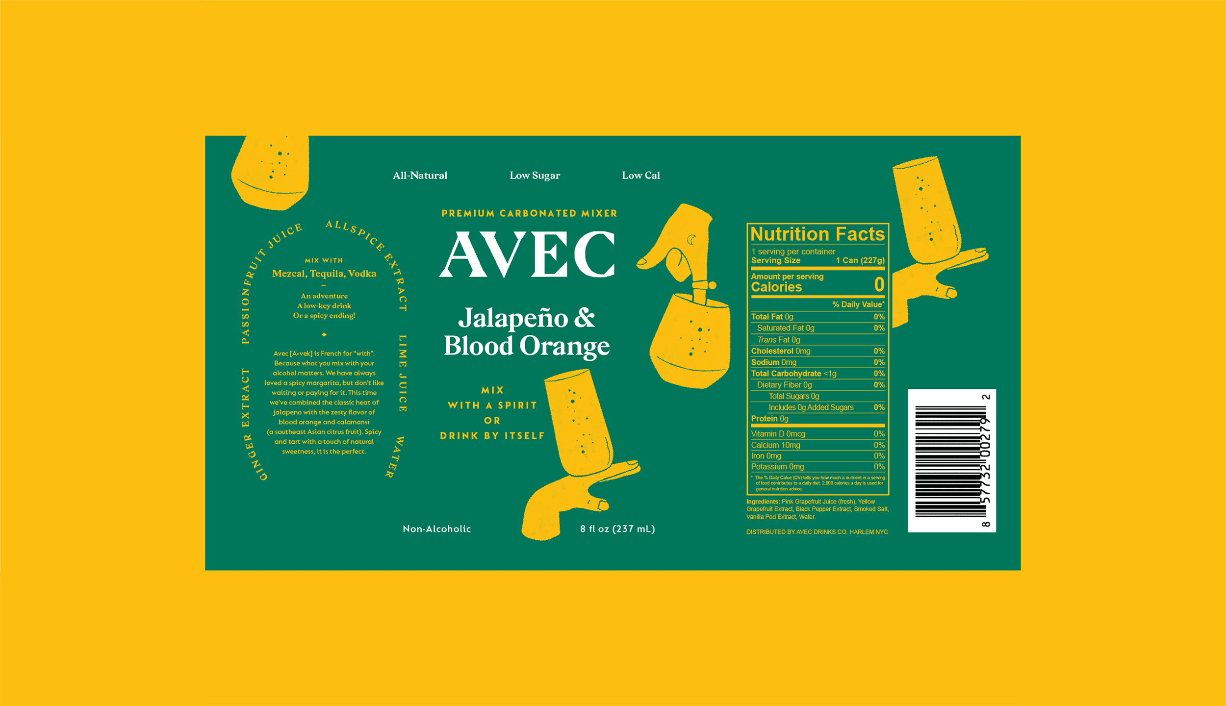
AVEC needed a launch identity for their all-natural cocktail mixers. I developed the brand from the ground up: logo, packaging, photography, and guidelines. The visual direction drew from 1920s post-prohibition aesthetics, capturing celebration and sophistication while positioning AVEC as a healthier, modern alternative.
The Galaxy Watch Ultra2 is Samsung's new flagship smartwatch, launched in July 2026 as part of a three-device flagship release. At Barbarian, I was responsible for the watch, creating the visual concepts for the launch site's product imagery, from the design reveal to the performance and battery stories. We adapted Samsung's site system to carry the new look for launch.
Robinhood Presents: The Lost City of Gold was the second annual keynote for Robinhood Gold, the company's premium membership, staged in San Francisco in March 2025 to unveil Strategies, Banking, and Cortex.
The identity we developed at the Violet Office extended the Robinhood Gold design system established by Porto Rocha. For The Lost City of Gold, we set the art direction, created the AI-assisted graphics, and designed the signage.
A short documentary on three groundbreaking New York glass artists — Deborah Czeresko, Grace Whiteside, and Tomoko Amaki Abe — reshaping a field long dominated by male maestros. I composed the original score, underscoring the heat and craft of the hot shop as these women, non-binary, and queer artists push glassblowing forward formally, conceptually, and demographically.
Google Marketing Live 2025 was Google's annual keynote for advertisers, broadcast from Mountain View in May 2025. Embedded on Google's in-house team, I helped translate its keynote concepts into a cohesive visual language and the storyboards that shaped the presentation.
Art direction and photography for the Duolingo X Crocs collaboration. I set the shoot's playful, high-saturation, product-forward look, building a library of images that carried the collab's irreverent energy across social and retail.
Campaign concept and art direction for Ten/Ten, spanning the key visual and its rollout across channels — a punchy, type-led system designed to scale from hero placements down to social.
A bold brand identity for African Chop House, a modern West African eatery. I developed the system end to end — logotype, color, menu, and signage — pairing heritage warmth with a clean, contemporary editorial voice.
Logo and social identity for The Radiance by Couture, a high-jewellery collection from De Beers. I designed the wordmark and built the supporting suite of social assets.
Blue Apron launched a limited-run packaging series to support their "Better Food, From Scratch" campaign. I worked alongside the campaign's art director to bring the film's illustration style onto the packaging — creating a visual thread that connected the TV spots to the product arriving on customers' doorsteps.
To build on Grubhub's "Click. Click. Food." campaign, our team developed an OOH look and feel built around a simple idea: infinite food at your fingertips. The art direction used flexible layouts showcasing popular delivery categories that rotated seasonally to keep the campaign fresh.
Potential Energy is a non-profit harnessing creativity to drive action against climate change. I developed the brand identity from logo through full system. The visual language is intentionally restrained: simplified, modern, and refined so the work itself can be the hero. The single "O" in the logotype serves as a subtle metaphor for our one and only planet.
Droga5's 10th anniversary was the right moment for a brand refresh. What started as a summer intern recruitment campaign became the catalyst for a full rebrand, proving we had the talent in-house to pull it off. I helped update the visual identity across the board: new typography, new color palette, internal signage, event branding for the D5 festival, and a custom intranet designed from scratch (staff directory, forms, company news, building maps). Everything evolved except the logo.
GoDaddy needed to shed its reputation for lowbrow marketing and reposition as a legitimate partner for small businesses. What started as a campaign to launch their new domain extensions (.nyc, .guru, .club) evolved into a full rebrand. I developed bold typography inspired by mid-century design, using type as the primary visual element. A signature "dynamic dash" graphic system stretched across layouts for visual cohesion across campaigns, web, print, and outdoor advertising.