Toga is a freelance Design Director in Brooklyn available for startups, studios, agencies, and non-profits.
Email:
toga@octoberoutpost.com
Now Reading 📖:
Myths to Live By
About Me

Toga Cox
Booked
Toga Cox is a Freelance Design Director based in Brooklyn with over a decade of experience across agencies like Droga5, Mother, and 72andSunny, and in-house teams at Spotify and Facebook. He brings a systems mindset and high craft to every project, with a multi-disciplinary skillset that lets him move fast and go wide while maintaining cohesion.
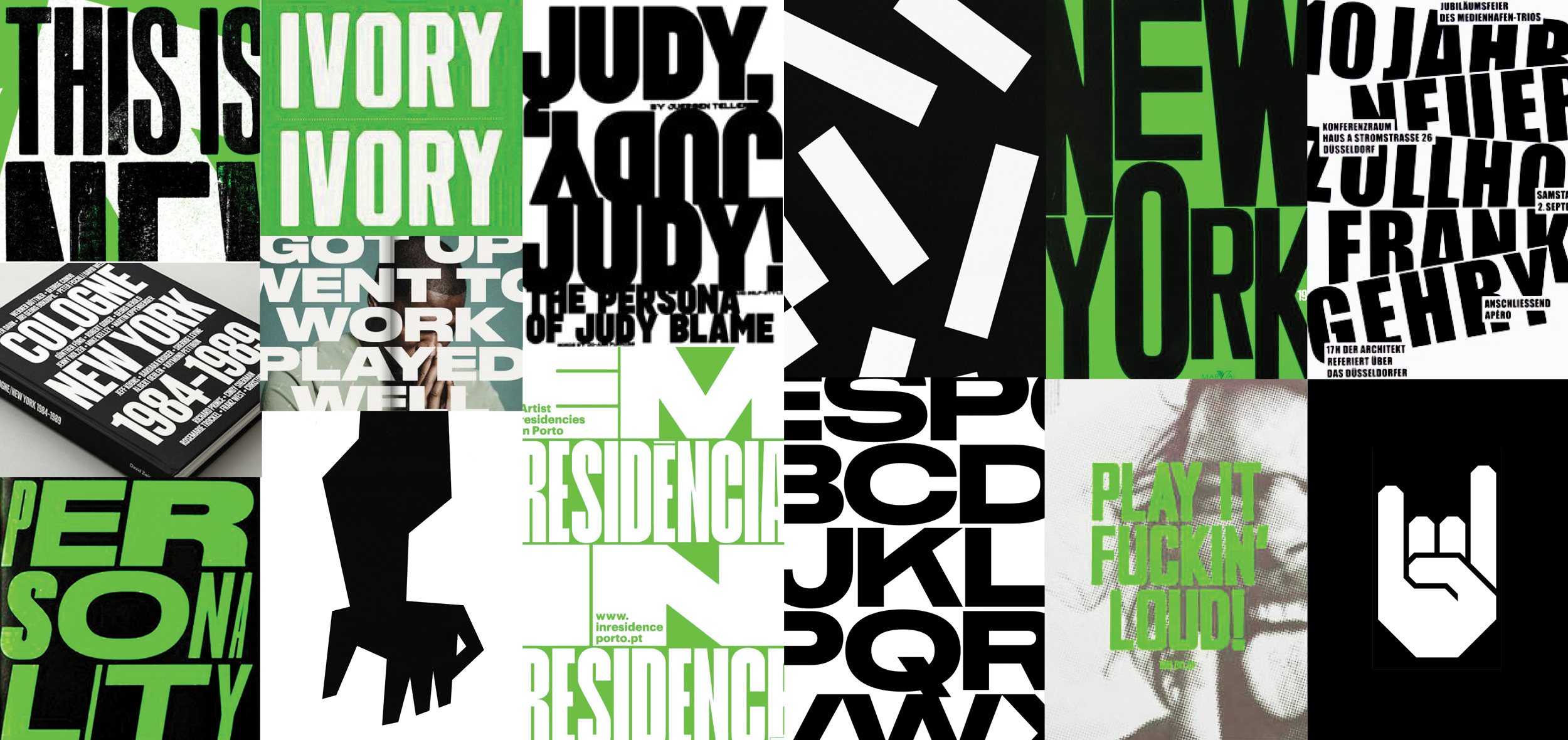
His creative philosophy leans toward the obvious-in-the-best-way: work that lands immediately but rewards a closer look. Visually, he gravitates toward bold, punchy graphics, heavy type, and high contrast work that commands attention. If you wouldn't scream it, don't say it.
That approach has taken him from designing award-winning ad campaigns to exhibiting during Art Basel Miami and having his photography published in The New York Times.
When he's not designing, he's writing music for indie films, at the gym, building furniture, playing with his two cats, or taking street photography in your neighborhood.
Toga is currently seeking freelance and full-time opportunities.
Agency Experience
72 and Sunny
Anomaly
Analog Folk
Barton F. Graf
BBH
Co:Collective
De-Yan
Droga5
Forsman+Bodenfors NY
Johannes Leonardo
Joan Creative
JWT
McCann NY
Mother NY
Ogilvy
Orchard Creative
Publicis NY
72 and Sunny
Anomaly
Analog Folk
Barton F. Graf
BBH
Co:Collective
De-Yan
Droga5
Forsman+Bodenfors NY
Johannes Leonardo
Joan Creative
JWT
McCann NY
Mother NY
Ogilvy
Orchard Creative
Publicis NY
Brand Experience
Adidas
Android
Budweiser
Blue Apron
Converse
De Beers
Delta
Duolingo
GoDaddy
Google
Meta
Mass Mutual
Nike
Robinhood
Spotify
Supercell
Under Armour
Verizon
Walmart
Waze
Adidas
Android
Budweiser
Blue Apron
Converse
De Beers
Delta
Duolingo
GoDaddy
Meta
Mass Mutual
Nike
Robinhood
Spotify
Supercell
Under Armour
Verizon
Walmart
Waze
Toolkit
After Effects
A.I.
Claude
Gemini
Midjourney
Runway
Weavy
Gemini
Midjourney
Runway
Weavy
Capture One
Cinema 4D
Figma
Illustrator
InDesign
Photoshop
Sketch
Cinema 4D
Figma
Illustrator
InDesign
Photoshop
Sketch
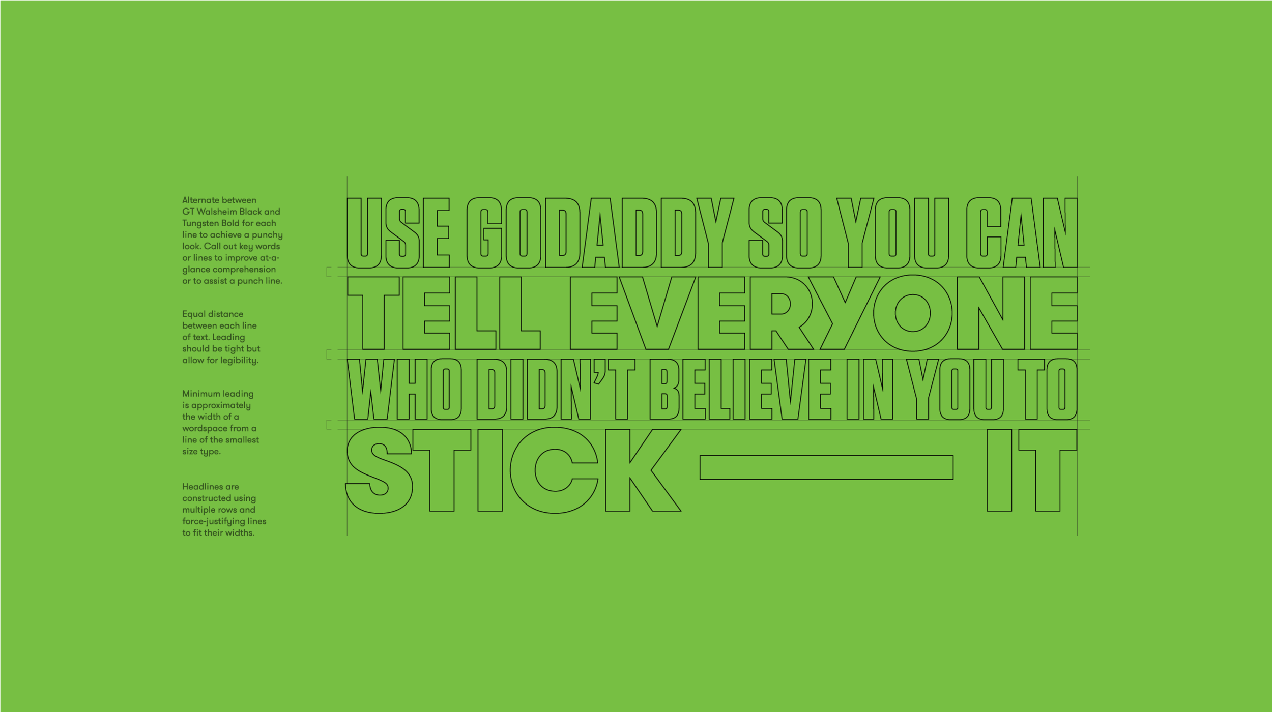
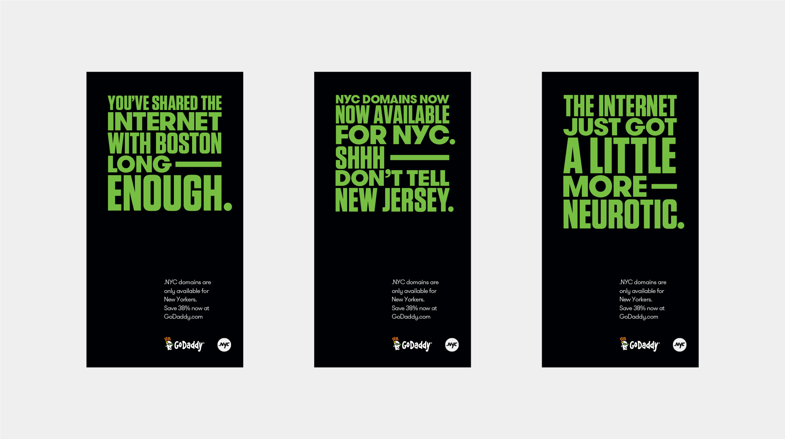
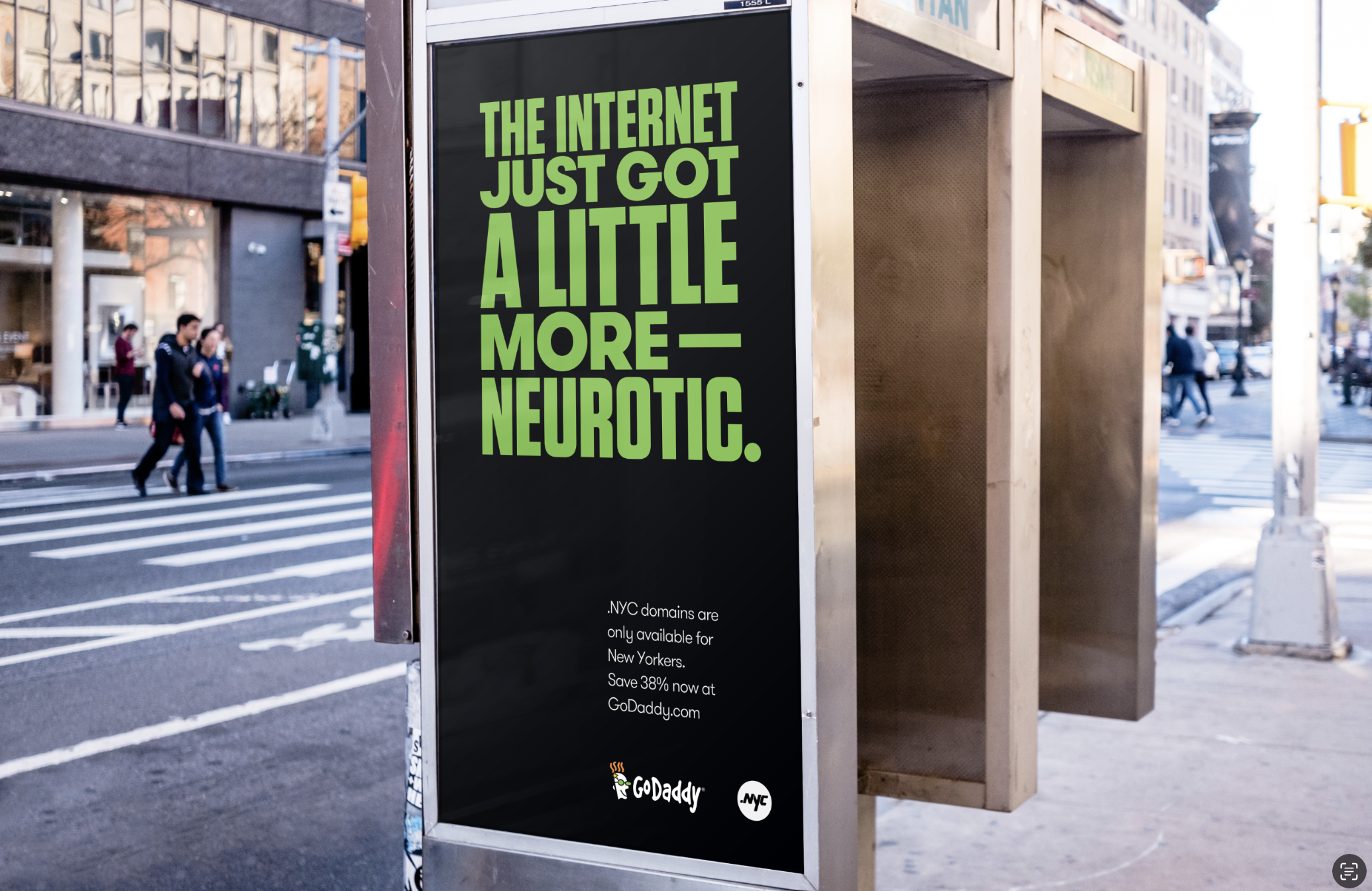
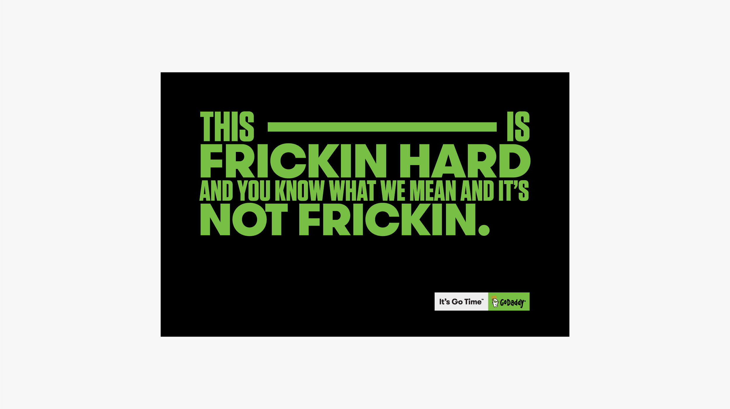
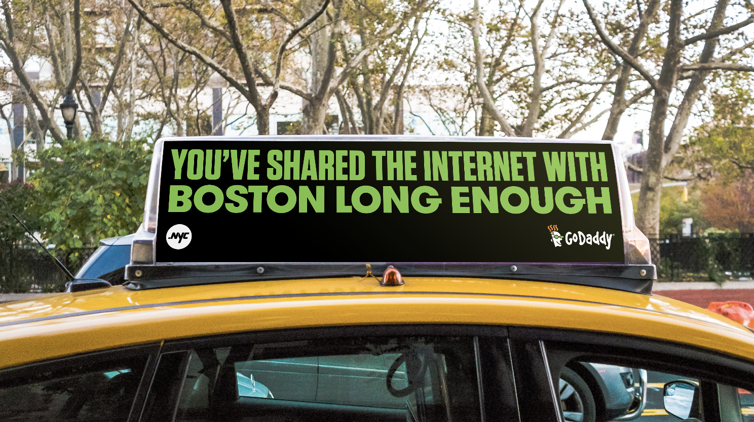
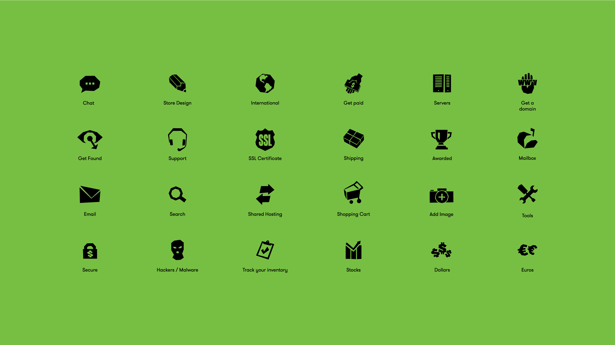
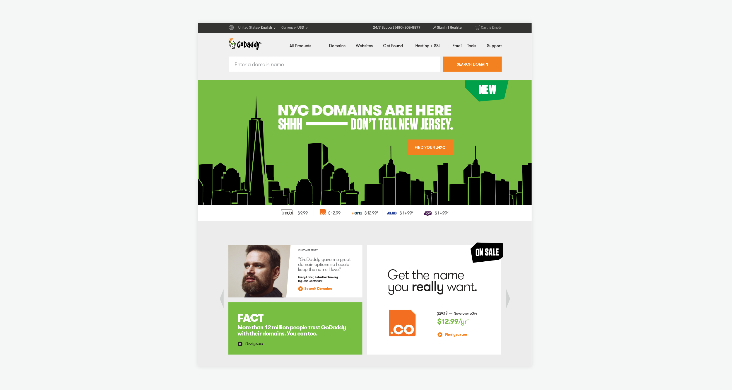
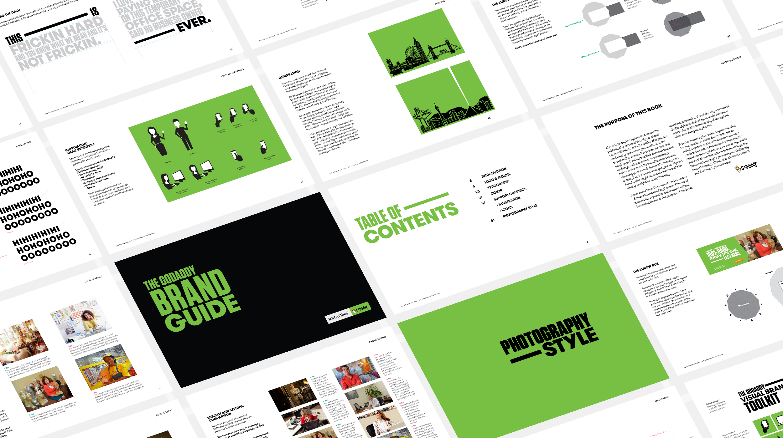
GoDaddy needed to shed its reputation for lowbrow marketing and reposition as a legitimate partner for small businesses. What started as a campaign to launch their new domain extensions (.nyc, .guru, .club) evolved into a full rebrand. I developed the core design direction: bold, punchy typography inspired by Saul Bass and 1950s storefront signage, with the type itself as the hero. A "dynamic dash" graphic became the system's signature, stretching to add energy across layouts. We delivered the full identity (typography, color, iconography, OOH, and print) while collaborating closely with GoDaddy's internal team to roll out the system across their web experience.
Credits
Created at Barton F. Graf
Role, Designer
Matt Egan, Design Director
The GoDaddy Design Team
Created at Barton F. Graf
Role, Designer
Matt Egan, Design Director
The GoDaddy Design Team
Press
jckonline
National Jeweler
jckonline
National Jeweler
Deliverables
Campaign Identity
Brand Identity
Template System
Iconography
Logo Refinement
Campaign Identity
Brand Identity
Template System
Iconography
Logo Refinement
Toga Julius-John Cox
Version 2.1
©2026